GRAPHING
Scientific Data on a Line Graph
The slope of a line on a graph is the same as the slope of a hill or
ramp. The conventional way of measuring slope is to determine the ratio
of the rise, y-axis, of the line to the run, x-axis, of the line. A hill
might rise 10 feet for every 5 feet it runs, fairly steep ~63 degrees.
While an everyday ramp may only rise half a meter as it runs 2 meters,
~14 degrees. On a graph the rise and run have specific units. In our example
of heating a balloon the rise has units of volume (mL) while the run has
units of temperature oC. The slope would have the units of mL/oC.
Based on the slope we should be able to predict the change in volume of
a balloon for every oC it is heated or cooled. To do this use
the formula for the slope of a line:
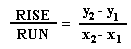
You take the values you need from the line on the graph, not specific
data points or the data table, unless the data truly lies along a straight
line. From our graph pick two points where the line intersects with x and
y gridlines, this makes determining exact values much easier.
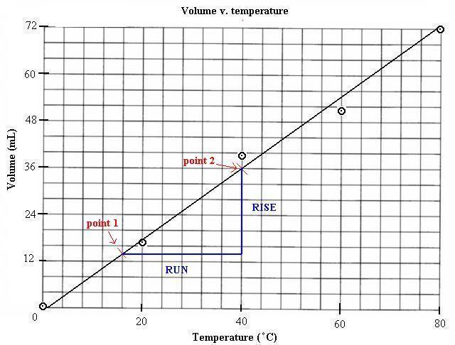 Notice on our graph that there is only one point on the line where the
gridlines and the best fit line intersect. When this is the case try to
find an intersection with a "x" or a "y" gridline halfway, such as with
the first point above.
Notice on our graph that there is only one point on the line where the
gridlines and the best fit line intersect. When this is the case try to
find an intersection with a "x" or a "y" gridline halfway, such as with
the first point above.
Now read the values of each point selected and substitute them into
the equation for slope:
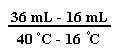 =
= = 0.83 mL for every one degree celcius change in temperature
With this value you can predict the volume of the balloon if you were
able to heat it to any particular temperature, change the starting volume,
etc. This is the usefulness of the slope; it gives you more (predictability)
information, based on a regular observed pattern, than you may have from
the data collected.
That's pretty much it for graphing basics. Keep plotting along.