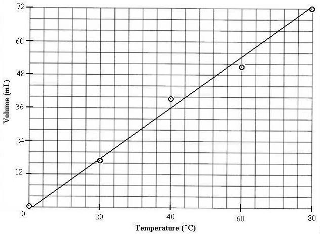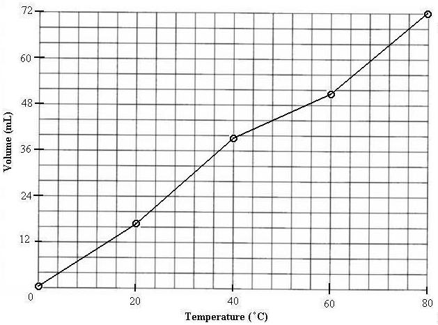
The next step is to draw either a "best fit curve" or connect the data
points. The best fit curve is designed to allow you to view the overall
trend of the entire data set, while connecting the data points allows you
to view the data intervals. In most cases, you will want to know the overall
trend/pattern of the data: direct, indirect, inverse, quadratic, linear....
The first graph is the beat fit curve. In this case the relationship
is linear, so a line is the "curve". Also notice that the line is taking
a visual average of all the data points, but not actually passing through
any of them. Do not simply draw a line connecting the origin or the first
point and the last point.

The next graph shows the connect the points option. This allows you to determine the specific behavior during each interval. This is often useful with a graph that does not show one definite trend but instead is a result of many changes.

But wait!...There's more...